

The scene repeats itself, almost identically, in dozens of steering committees every quarter. A Product and/or UX lead (the set of disciplines that study and design the experience a user has of a product) projects a flawless chart: task success rate up from 61% to 84%, usability score climbing to 74. Polite silence around the table. Then the question that kills it, spoken or merely thought: “So what?” Next year’s budget won’t move by a cent. The product & UX metrics just presented, however rigorous, convinced no one.

Two languages for the same metrics
This isn’t a competence problem, or even a proof problem. It’s a translation problem. That is the thesis defended by Anna Kaley, director of consulting at the Nielsen Norman Group (NN/g), the user-research reference firm founded in 1998, in an article published in early July 2026. Trained as a journalist before building a nineteen-year career in user research and consulting, Kaley makes a simple claim: product and UX teams measure what she calls upstream metrics, the ones that describe how well an interface performs, such as task success rate or the SUS (System Usability Score, a score out of 100 that summarizes, from a short standardized questionnaire, a product’s perceived ease of use). A chief financial officer has no frame of reference for judging whether 74 is a good score. A VP of operations cannot connect a completion rate to the quarterly target she answers for in front of her own leadership. The product team speaks interface; the company speaks revenue, cost, risk, timelines, retention. Two languages, one meeting, and nobody translates. This need to endlessly justify one’s worth isn’t unique to UX either: it runs through an entire profession, caught between more power and more fear as artificial intelligence reshuffles the deck of product work.
An obsession that isn’t new
Kaley didn’t invent the problem: she is extending a project NN/g has been digging into for more than twenty years. As early as 2003, the firm published a foundational report on the return on investment (ROI, the gap between what a project costs and what it delivers) of usability, built on an analysis of 72 redesign projects, and it has kept returning to the subject since, down to a more recent warning titled Three Myths About Calculating ROI of UX, about the dangerous shortcuts of that calculation. Back in 2010, at Google, researcher Kerry Rodden had already formalized the HEART framework (Happiness, Engagement, Adoption, Retention, Task Success: five families of usage signals), one of the first serious attempts to connect these signals to the OKRs (Objectives and Key Results, a management method that pairs each objective with a handful of measurable results) an organization tracks. Kaley’s article, then, is not an isolated media moment: it is a new chapter in a long-running structural debate, the one that pits the measurement of output (what a team ships: a feature, a fix, a redesigned screen) against the measurement of outcome (what that shipment actually changes in user behavior or in the company’s results).
The translation table: five levers, not a hundred dashboards
What the July 2026 article contributes concretely is a directly usable reading grid. Kaley proposes mapping each upstream metric to one of five levers that every leadership team already tracks: revenue, cost, risk, speed to market, and customer retention. A falling error rate on a checkout flow no longer shows up as an abstract usability improvement, but as an expected drop in support contact volume, hence in cost. A rising task success rate on a sign-up flow translates into a likely gain in conversion rate, hence in revenue. The exercise doesn’t require abandoning the metrics already being collected: it consists of building, next to each one, the sentence that connects it to what leadership is already watching.
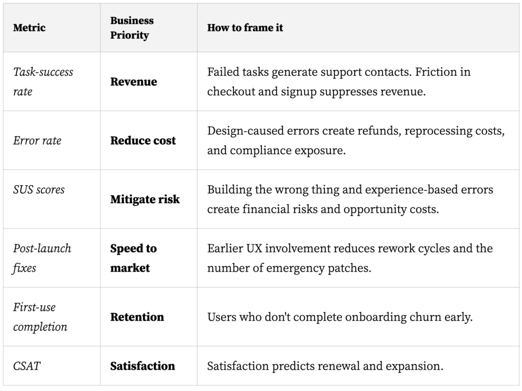
What this shift really changes
The shift looks modest; it isn’t. A team that reports in outputs positions itself, without meaning to, as a cost center whose usefulness gets relitigated every budget cycle. A team that reports in outcomes positions itself as a partner in the company’s performance, whose contribution gets discussed instead. That is the larger stake behind the outcomes over outputs movement that has run through product management for a decade: the legitimacy of a product or UX function is no longer decided by the quality of its work alone, but by its ability to demonstrate that work’s reach in the language of whoever allocates resources. It is also, more quietly, a shift in posture: the UX or product practitioner has to learn to reason like a financial controller, without ceasing to reason like a researcher. This paradox isn’t isolated: it echoes one already documented here, of the best-performing products that don’t always win, for lack of having convinced whoever decides their fate.
Translating isn’t proving
The risk, documented by NN/g itself in its own warnings about ROI calculations, is confusing a displayed correlation with proof of causation. A task success rate climbing twenty points doesn’t guarantee revenue will follow in the same proportion: conversion, retention, or support costs also depend on price, competition, a marketing campaign, or seasonality. Kaley’s grid helps formulate a plausible hypothesis, not establish a measured result, and no controlled study yet quantifies the real gain this reporting practice delivers on the budget decisions it aims to influence. There is also a more insidious risk, well known to readers of the critical literature on vanity metrics (numbers that look impressive without saying anything about the value actually created): by dint of reporting what leadership wants to hear, a team can end up optimizing the metric rather than the problem it is supposed to represent. Translating a result into business language is an exercise in clarity, not a substitute for the rigor of the measurement itself. This risk isn’t unique to reporting: it is the same one already flagged here about prioritization grids like MoSCoW, Kano, or RICE, when the tool ends up replacing the judgment it was only meant to inform.
Monday morning, before the next committee
The application is immediate. Before the next roadmap review or the next budget request, take the last user test conducted and rephrase its headline finding under one of the five levers: revenue, cost, risk, speed, retention. Not “task success rate rose from 61% to 84%,” but “fewer abandoned checkouts, hence fewer support calls and fewer lost carts.” The difference fits in one sentence, but that sentence, precisely, is the one leadership remembers. NN/g has since carried the subject into several video formats, a sign the organization treats it as a sustained effort rather than a one-off article: that is also the bet this piece makes, that a translation skill is quietly becoming as essential to the craft as running a user interview.
Sources
- Stop Reporting UX Activity and Report Business Outcomes · Nielsen Norman Group
- Three Myths About Calculating ROI of UX · Nielsen Norman Group
- Return on Investment for Usability · Nielsen Norman Group
The article behind this analysis, “Stop Reporting UX Activity and Report Business Outcomes” by Anna Kaley, is available on the Nielsen Norman Group website.











 CC BY-SA 4.0